Glovo Motion Ads
This project aims to create a digital scalable ads for UAC (universal app campaigns) and Meta (Instagram) to acquire new customers with Glovo's partner McDonald’s.
Client
Creative Challenge
Year
2024
Credits
Concept - Sergi
Strategy - Sergi
Graphic Design - Sergi
Motion Graphics - Sergi
Strategy - Sergi
Graphic Design - Sergi
Motion Graphics - Sergi
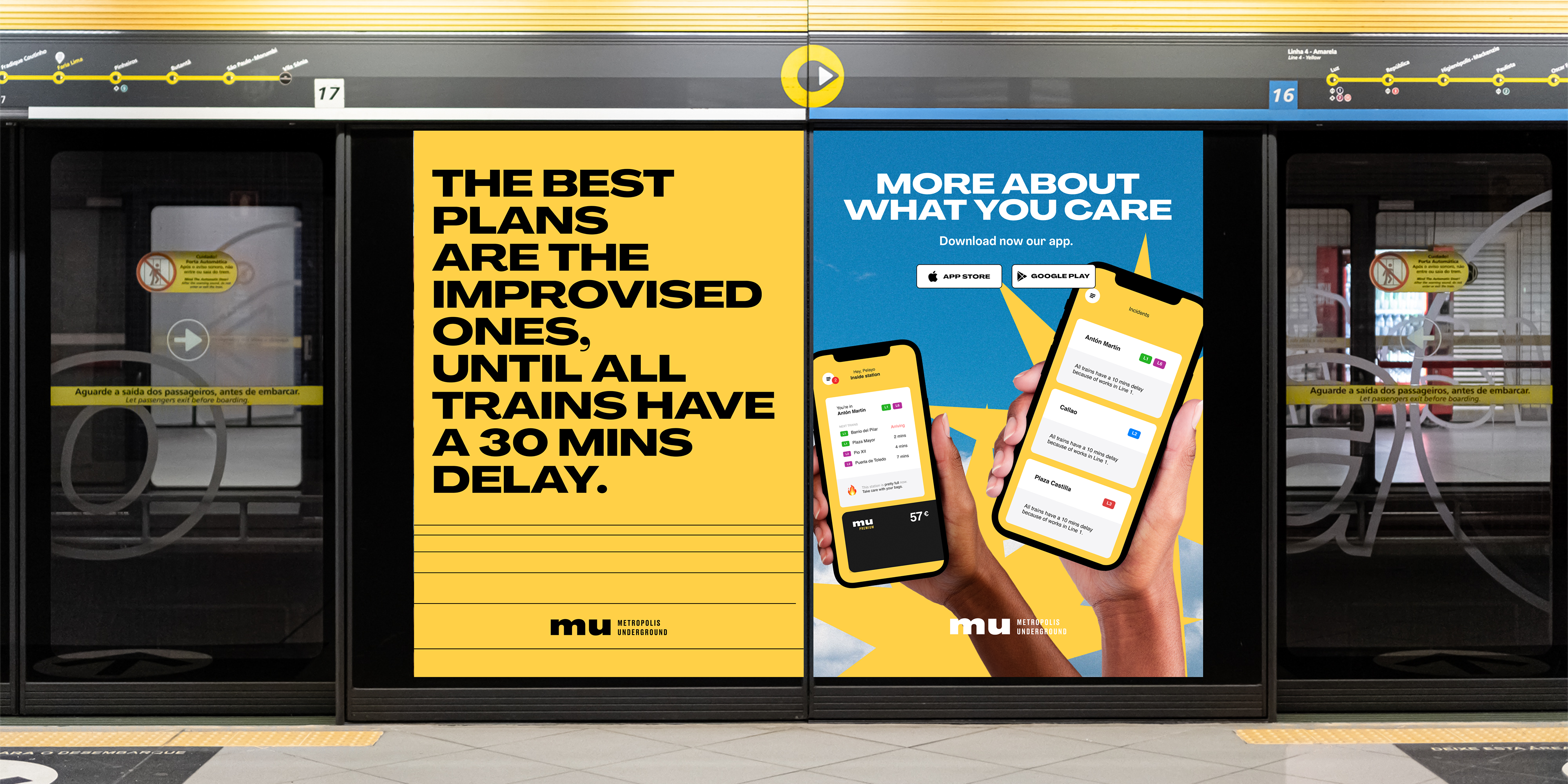
Target Audience & Segmentation
Young professionals. These are individuals between the ages of 25 and 40, with a busy lifestyle, who are looking for quick and convenient solutions for their daily needs.
College students. Generally, this group does not have a lot of time to cook or shop, so they turn to services like Glovo to meet their food and daily needs.
Urban families. Families with children who, for convenience or lack of time, choose to request home deliveries of either groceries or prepared food
Defining the target audience, it's crucial for obtaining successful results. For this campaign, the main audiences are Young professionals, Collage Students and Urban Families, appealing to them through the Fast food and restaurant market, embracing a playful and bold approach.
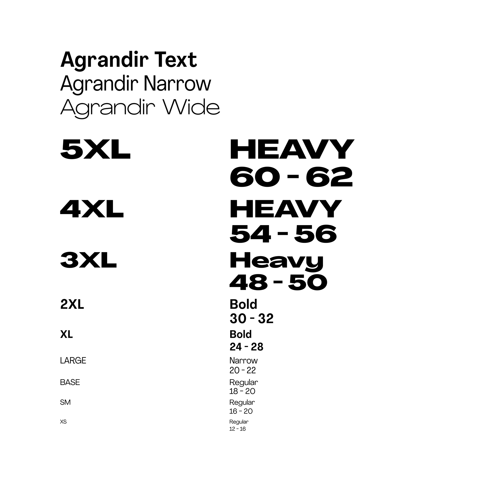
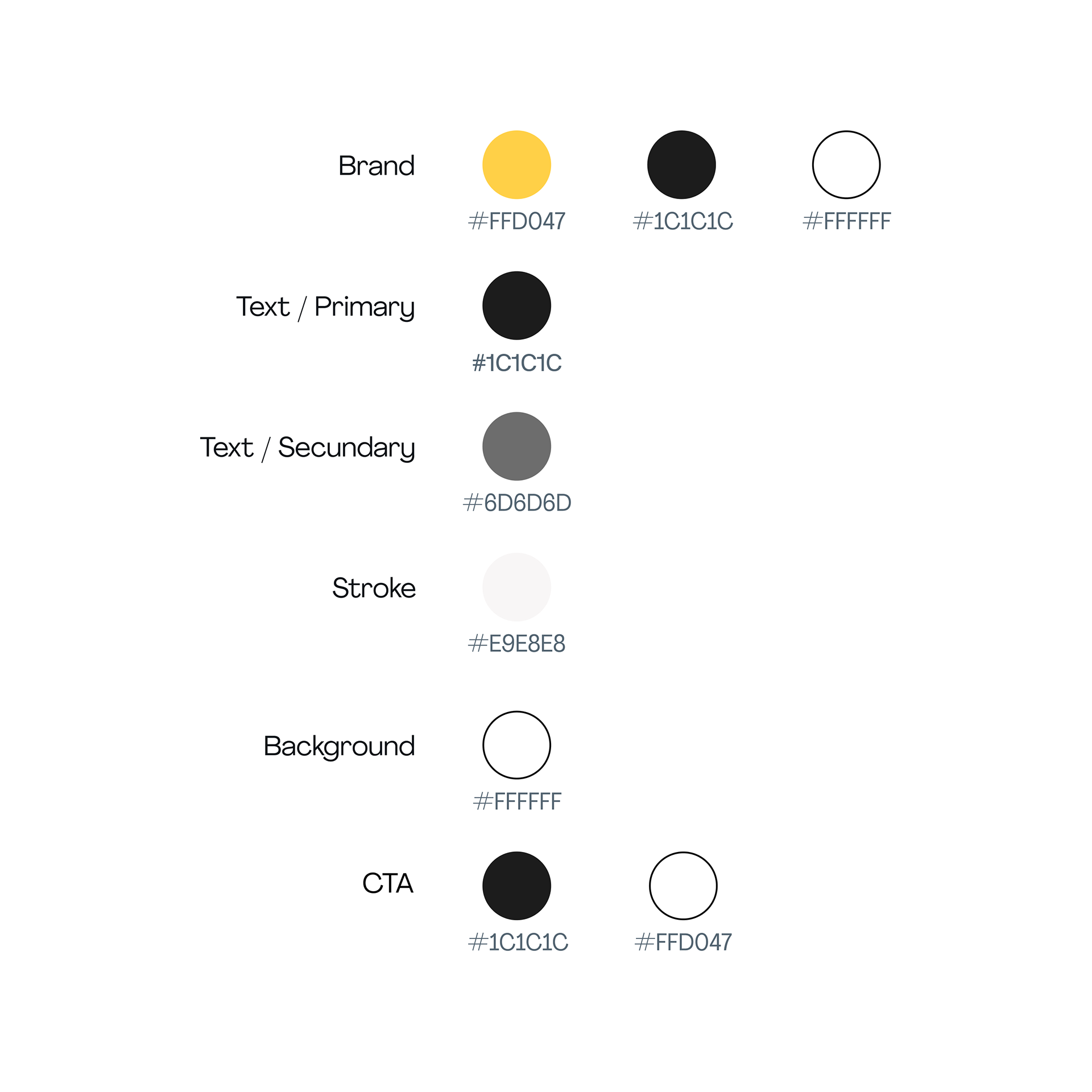
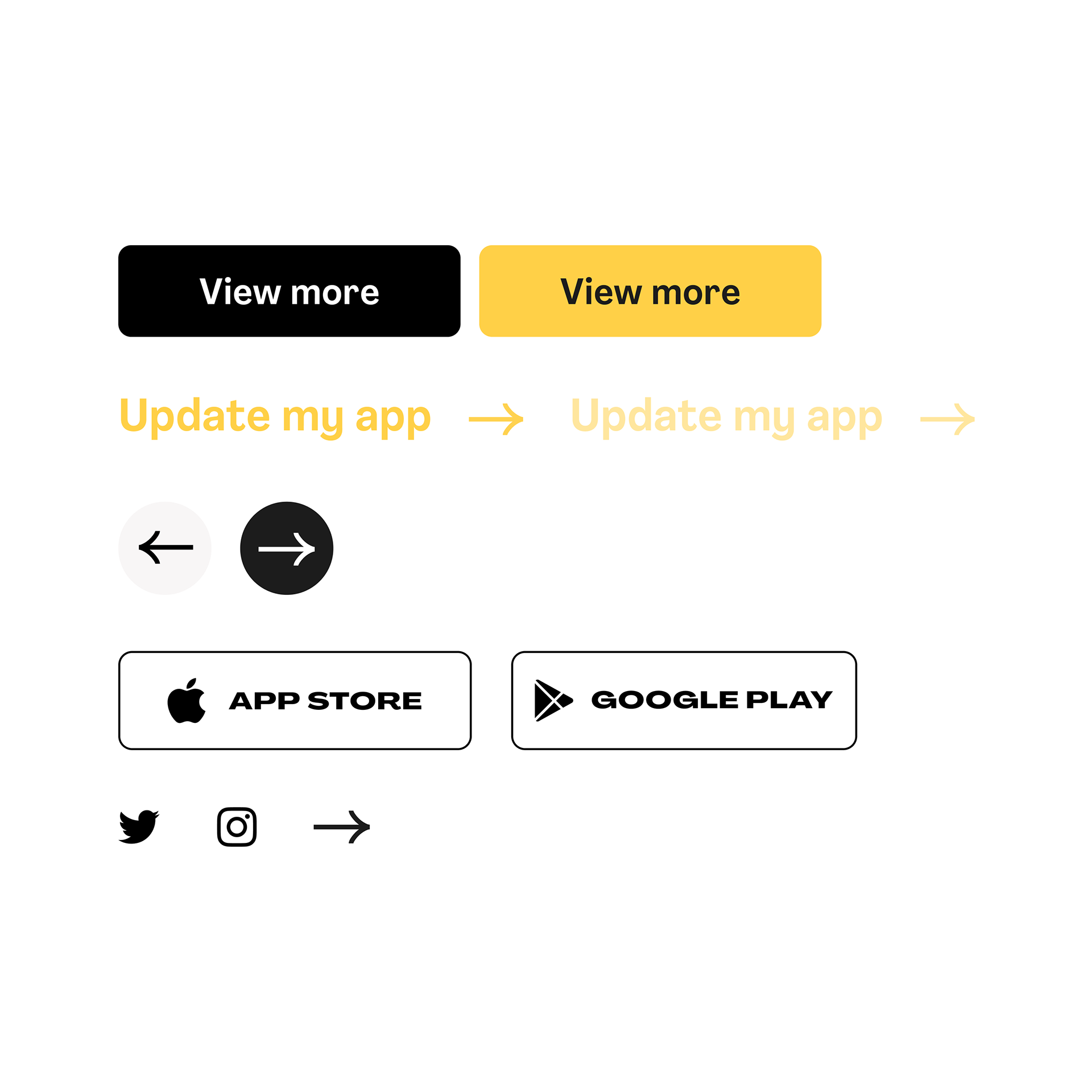
Style-Guide
The direction is based on the statement of not inventing anything new or to create anything from scratch, rather carry the brand DNA through every design and iterate on designs already performing well. To archive this premise and also bring something fresh to the table three principles have been established before designing:
Less is more. Simplicity and clarity are part of what makes a successful ad. Removal of unnecessary elements by refusing clutter and focusing attention on the core message.
Clear and direct. This means explaining things the simplest and most accessible way possible, effectively meeting users needs and desires.
Good vibes. Creating an atmosphere of positivity and emotional connection through visual elements. By having more human and kind approach, users can leave with a lasting and positive impression.
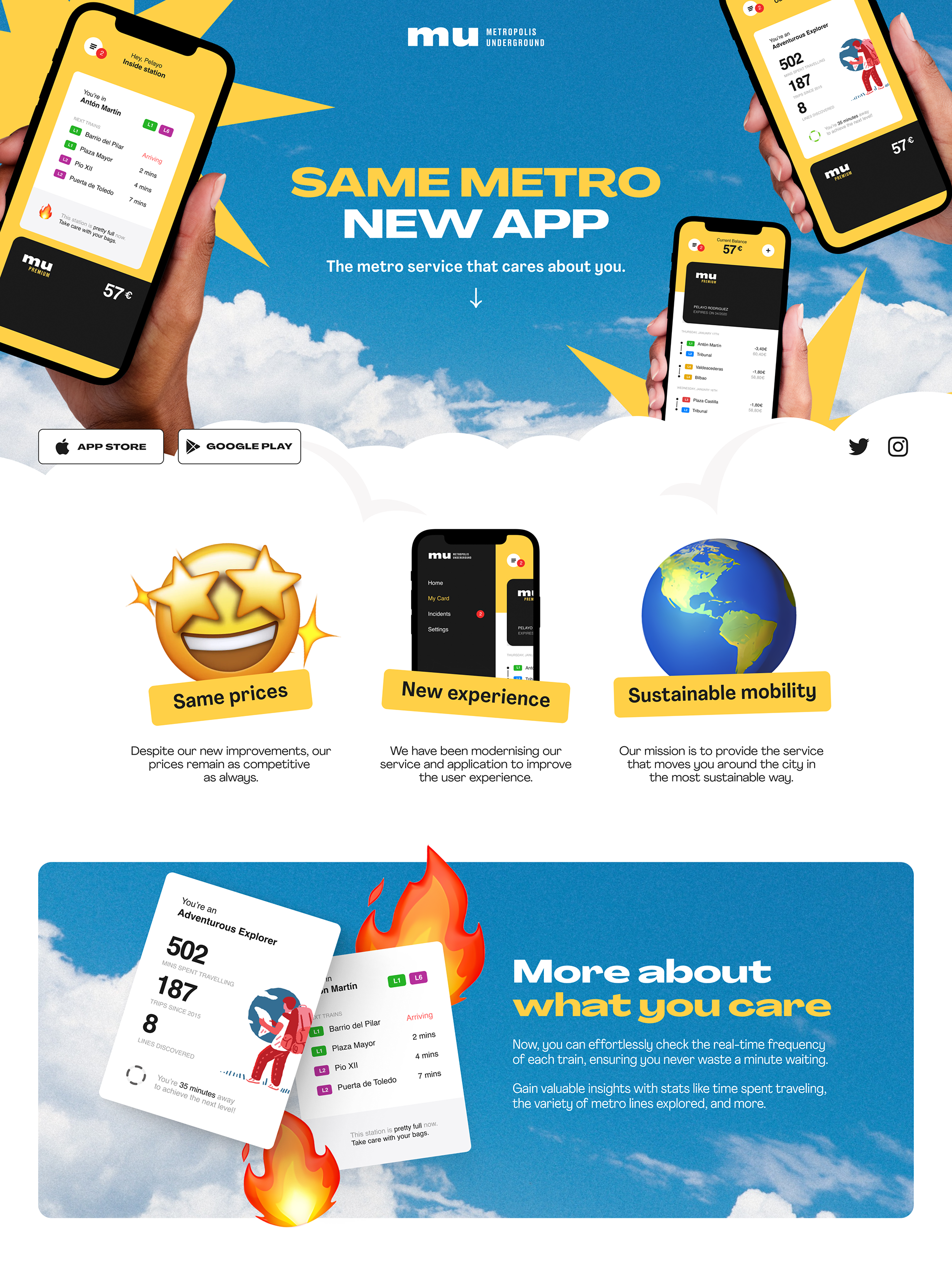
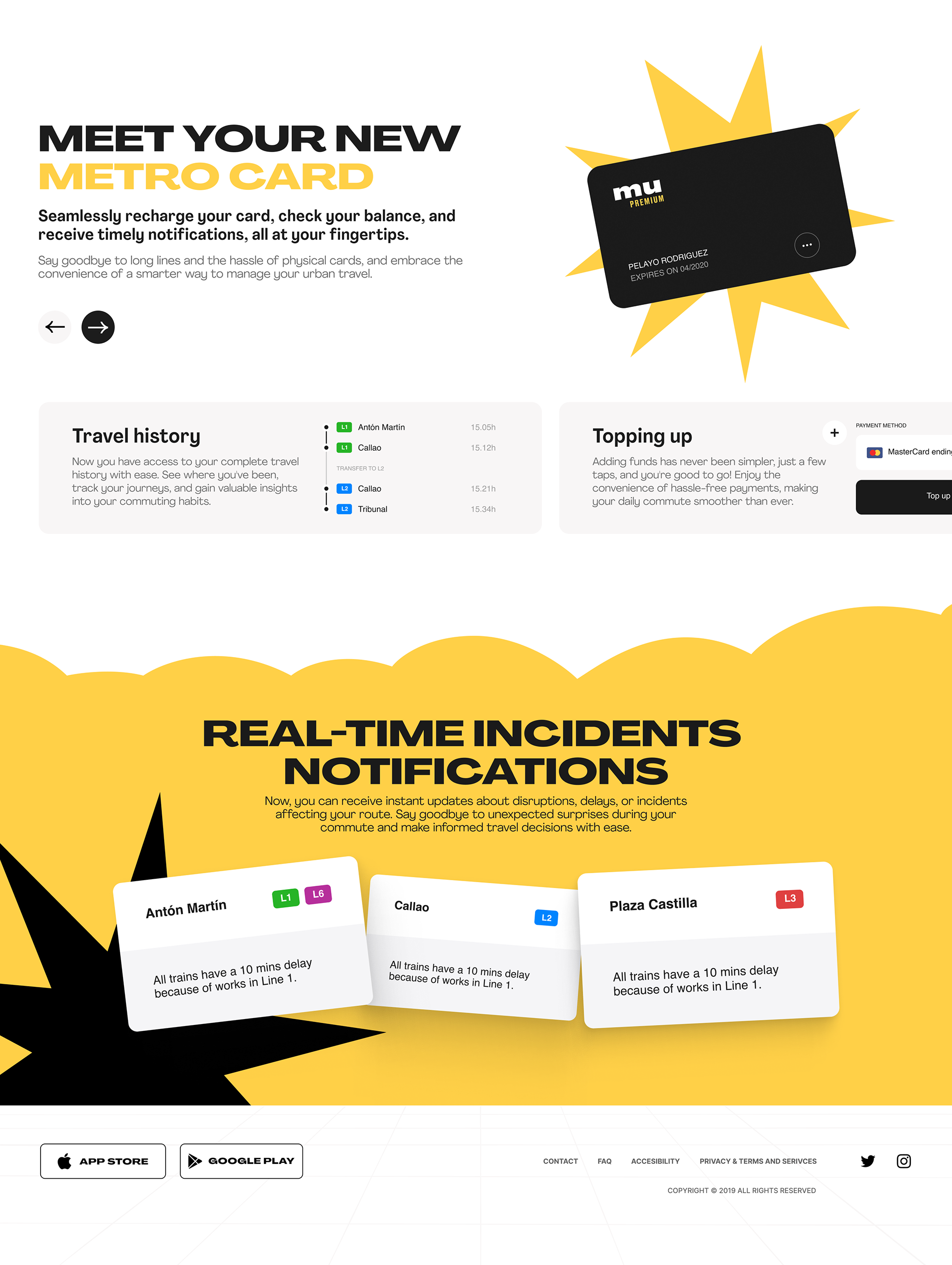
Meta Ad
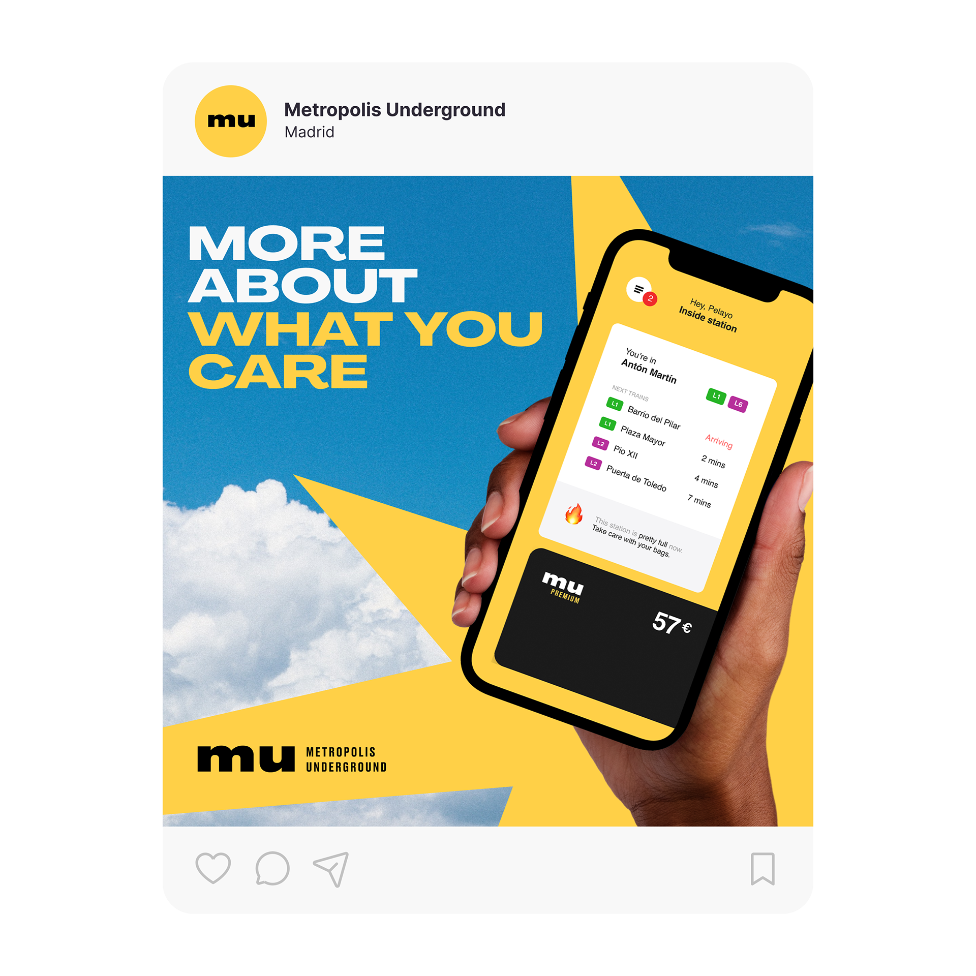
I've taken the bold and captivating elements from the desktop version and seamlessly transformed them into a mobile-friendly format. The goal was to prioritize clarity and accessibility, streamlining content and navigation while preserving the essence of MU brand's visual identity.
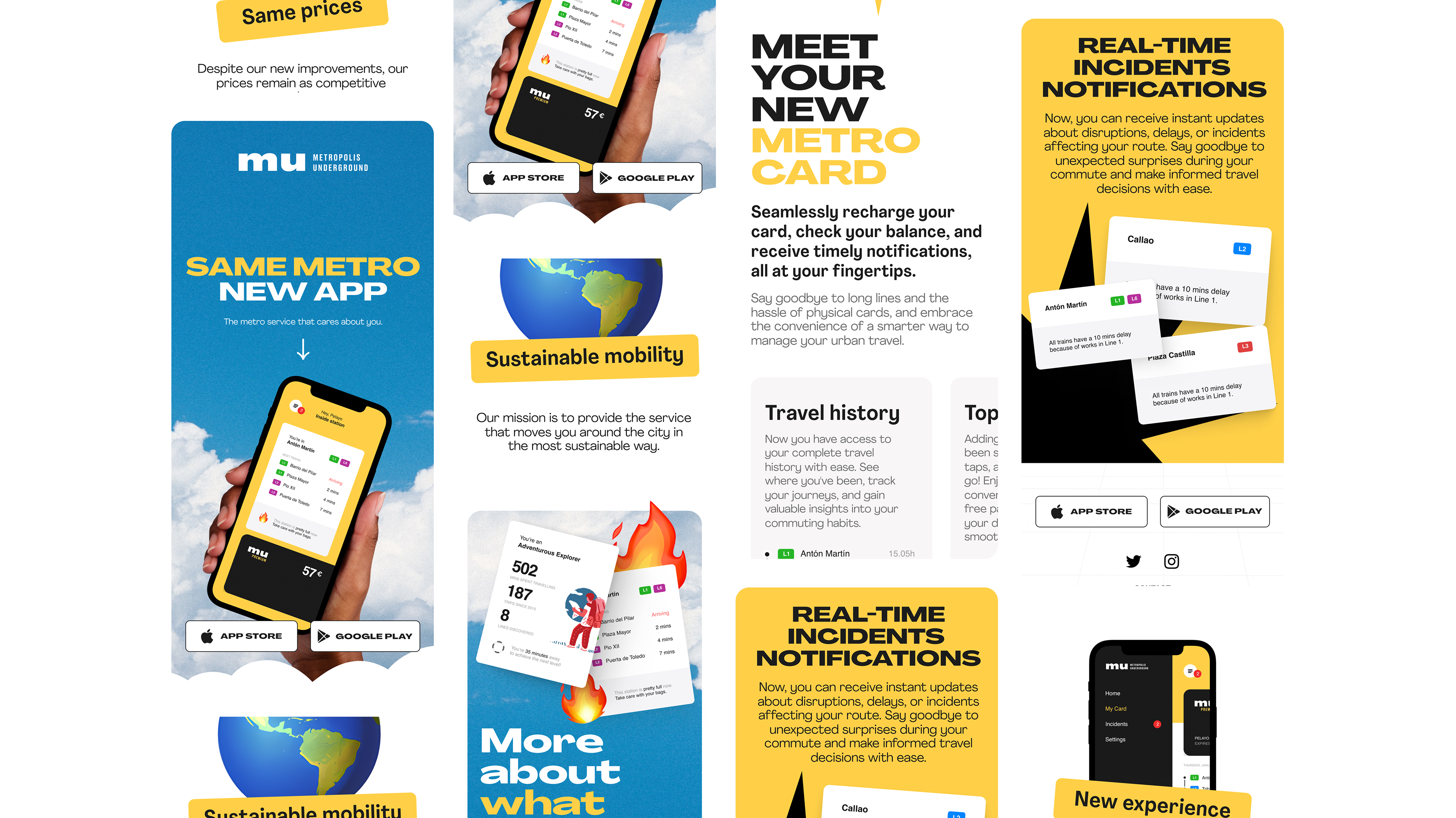
Promotional Mailing - Design Strategy
Personalized message. A more personal and direct language helps attract the user's attention and interest in the content.
Relevant information. The information has been synthesized, showing only the most attractive news for the public, leaving the landing page as the informative element.
Visual coherence with the rest of the elements. The same visual style that defines the brand and the landing page has been maintained, ensuring visual continuity between the different elements.
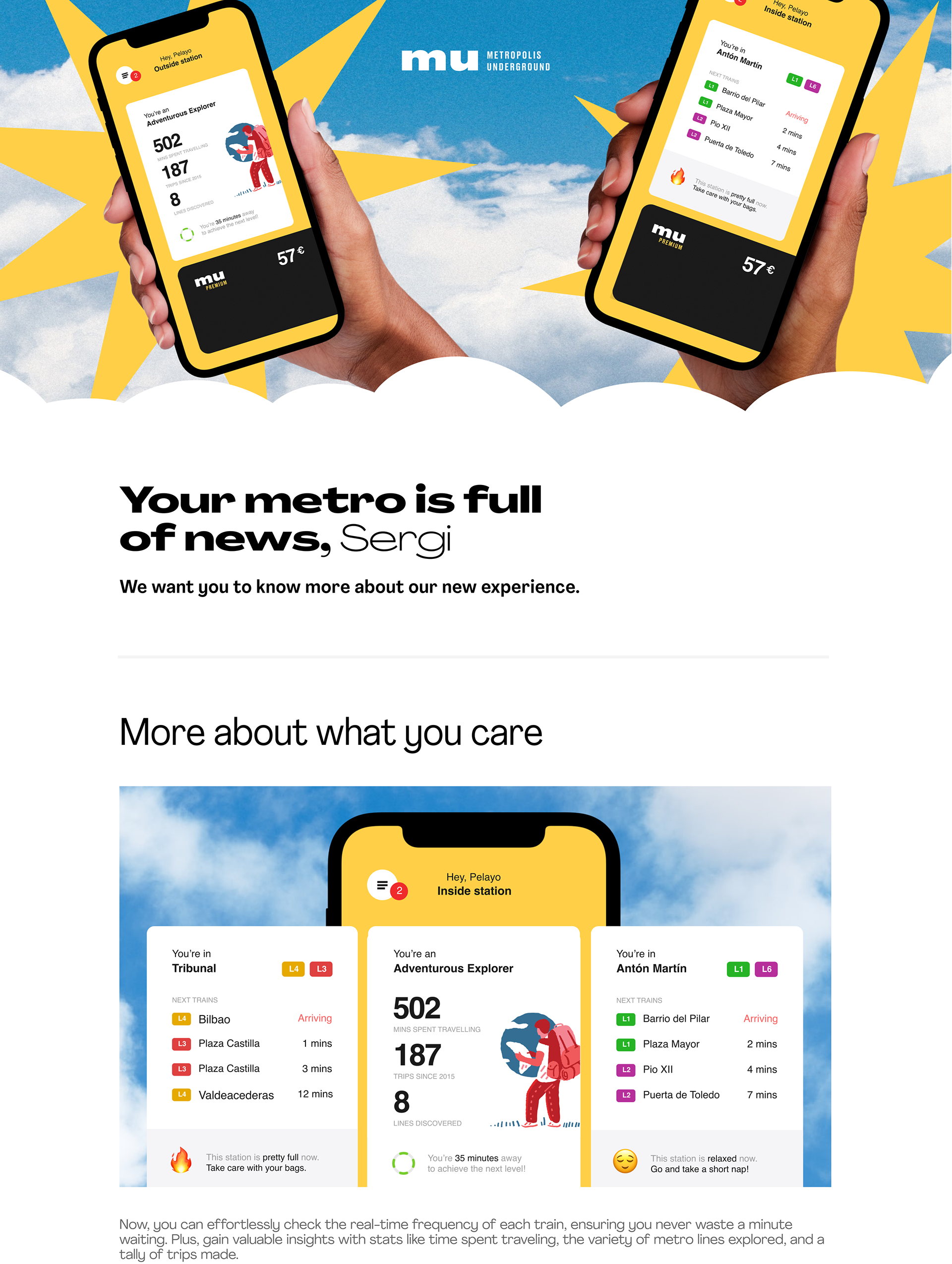

Digital Ads & Social Media
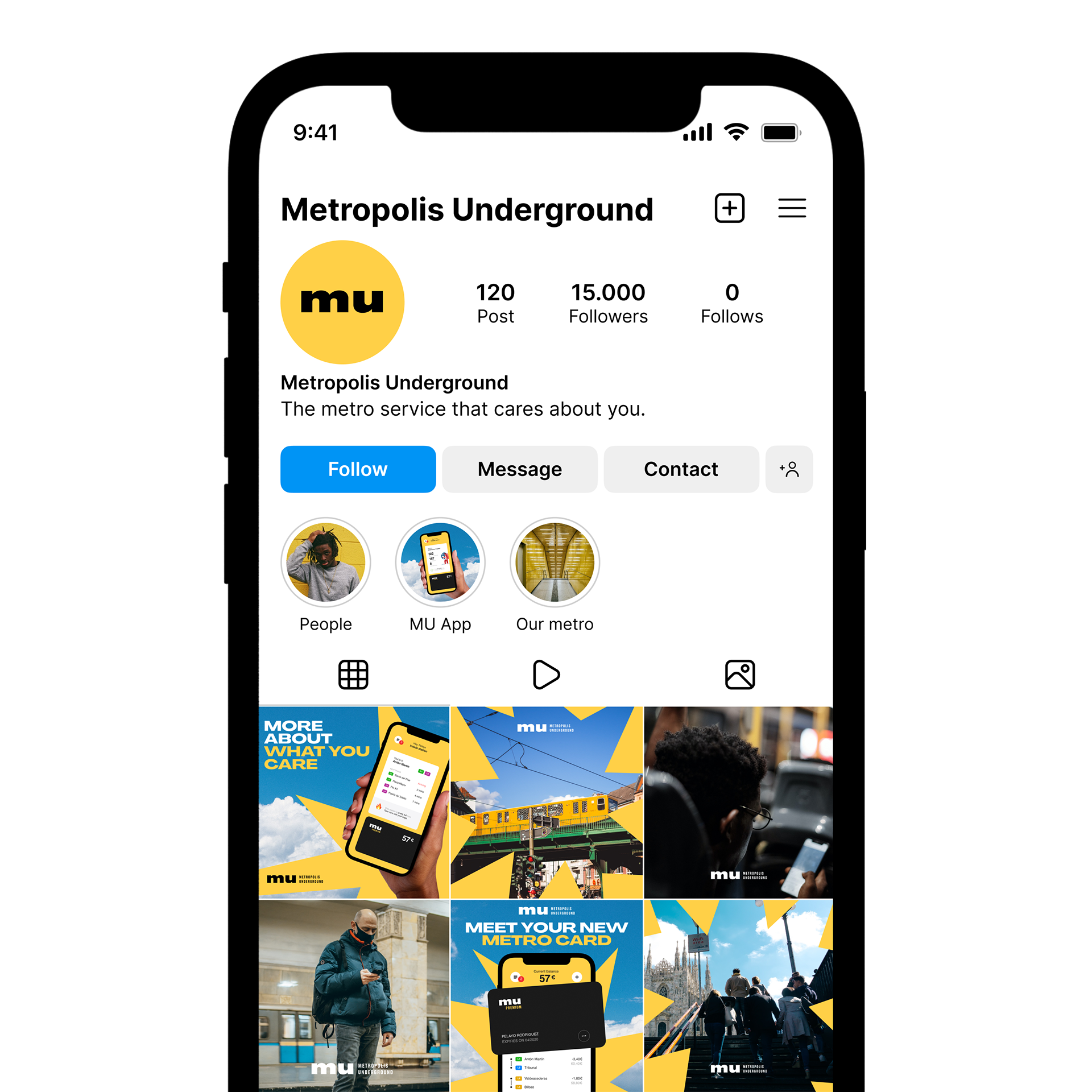
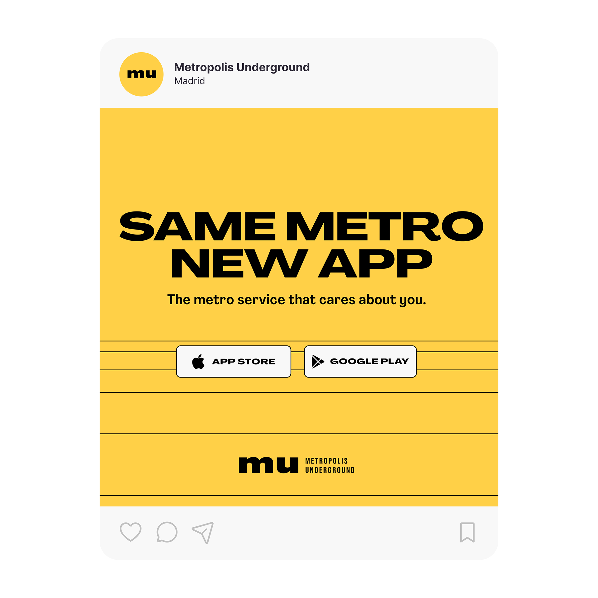
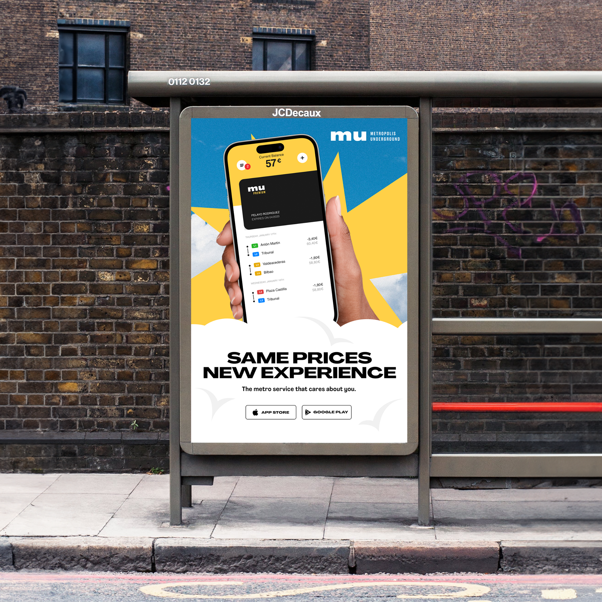
I've carried the brand visual identity to this ads, ensuring every ad exudes consistency and coherence. The messaging is tailored for a young and vibrant audience, speaking their language and addressing their problems.
