Metropolis Underground
MU is the metro service of the city of Metropolis. In recent years MU has been modernising its service and applications to improve the user experience. Now Metropolis wants to show everyone that despite these new improvements, their prices remain as competitive as always.
Client
Personal Project
Year
2024
Credits
Concept - Sergi
Creative Direction - Sergi
UX/UI Design - Sergi
Graphic Design - Sergi
Motion Graphics - Sergi
Creative Direction - Sergi
UX/UI Design - Sergi
Graphic Design - Sergi
Motion Graphics - Sergi
The goal
The challenge is to create an email that communicates the new app
features to users who have not logged into the mobile application for more
than three months as well as to create a landing page where they can get
more information if they so desire.
features to users who have not logged into the mobile application for more
than three months as well as to create a landing page where they can get
more information if they so desire.
The direction
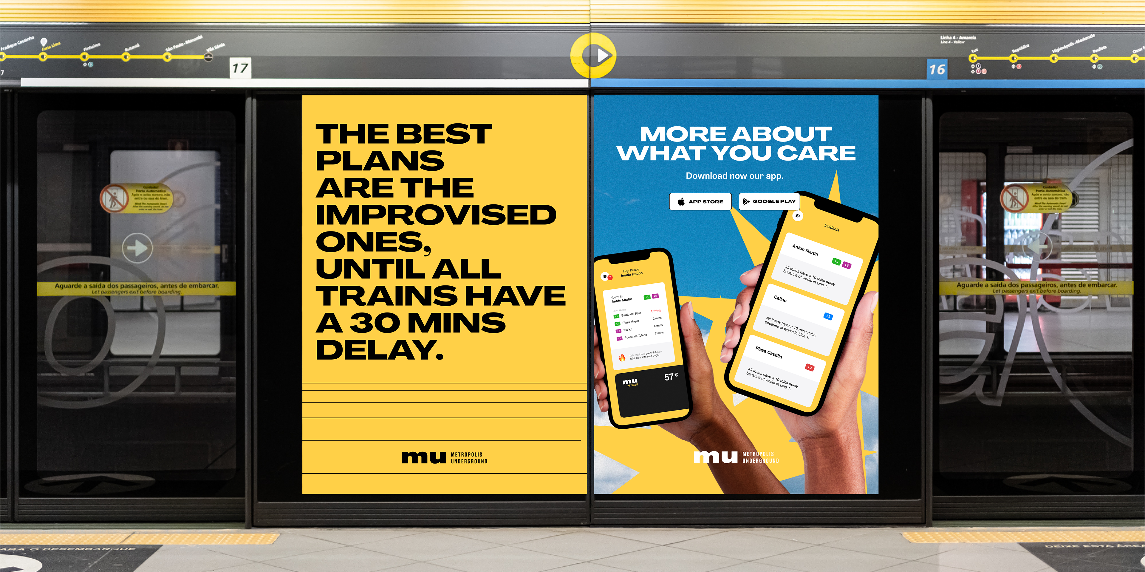
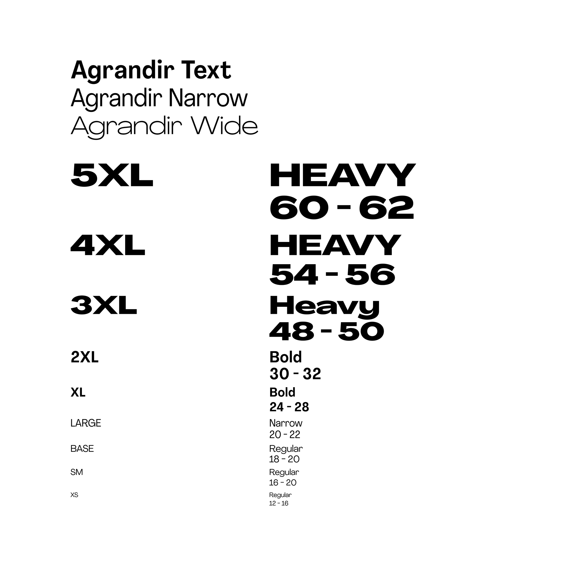
For this project I’ve embraced a playful and bold graphic design to capture the youthful energy and spirit of MU target audience. These eye-catching visuals not only grab attention but also convey a sense of enthusiasm and adventure. A bridge between Metropolis Underground rich history and commitment to innovation, forging a path toward a brighter future for Metropolis and its citizens.
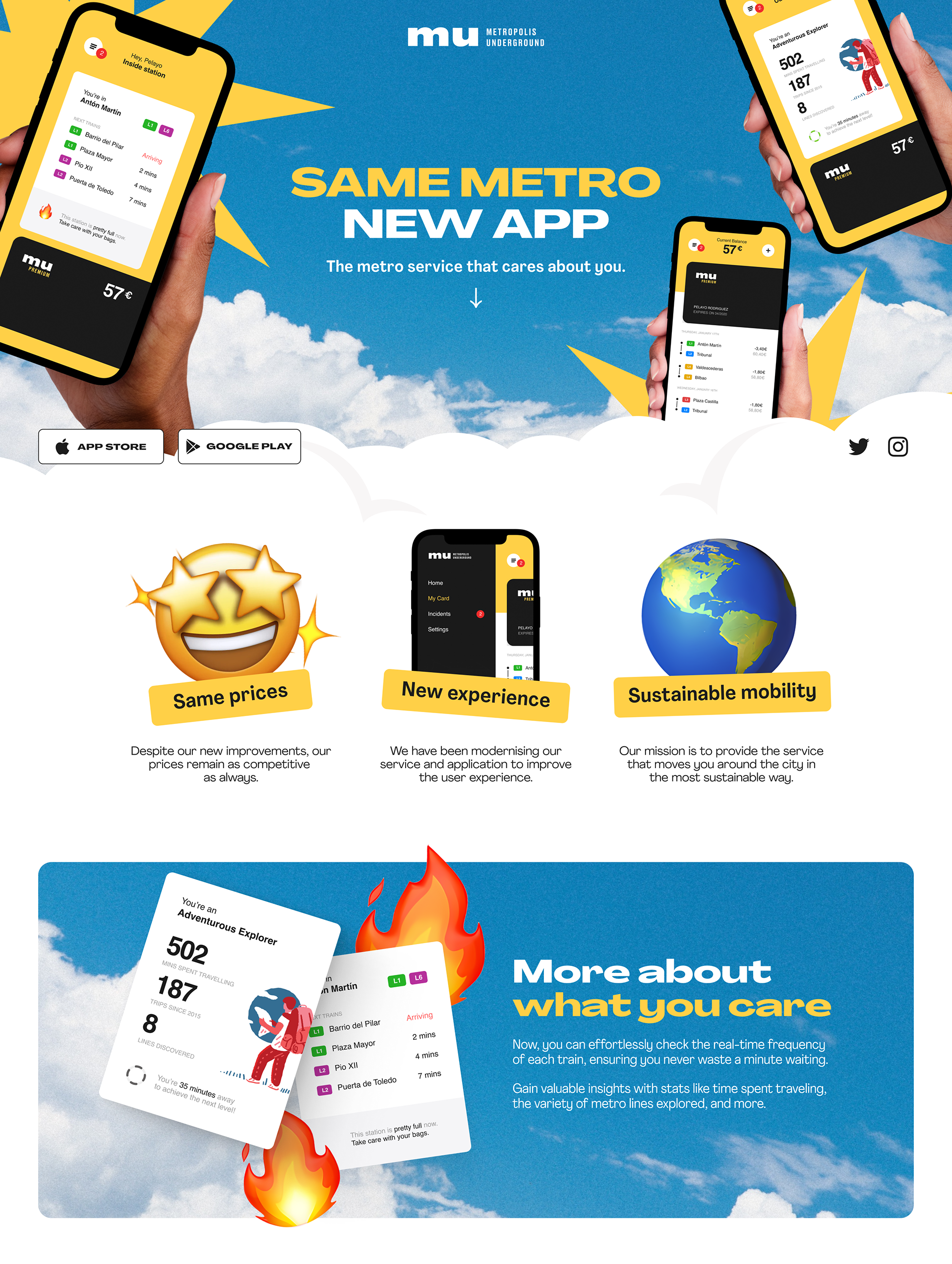
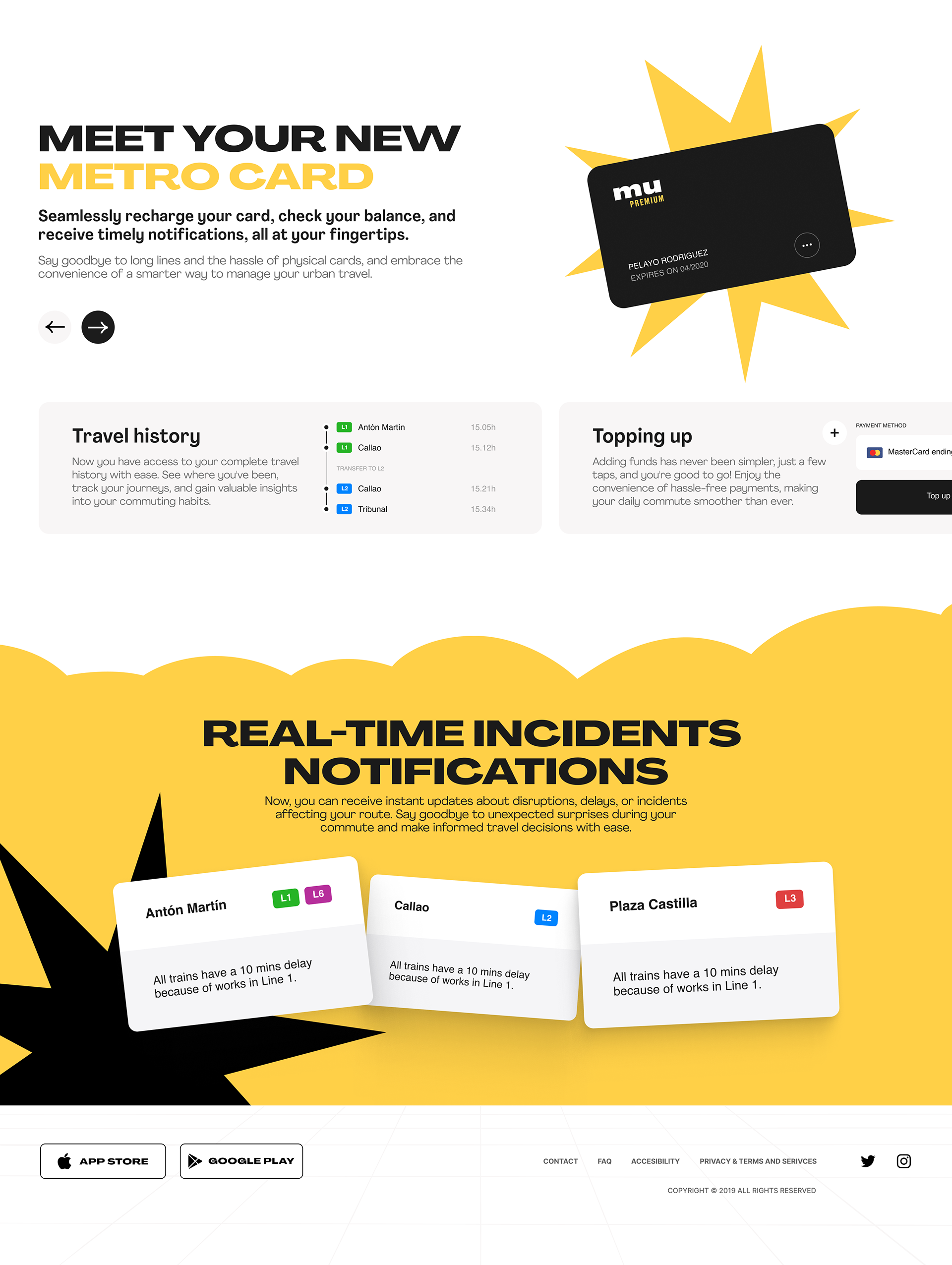
Landing Page - Design Strategy
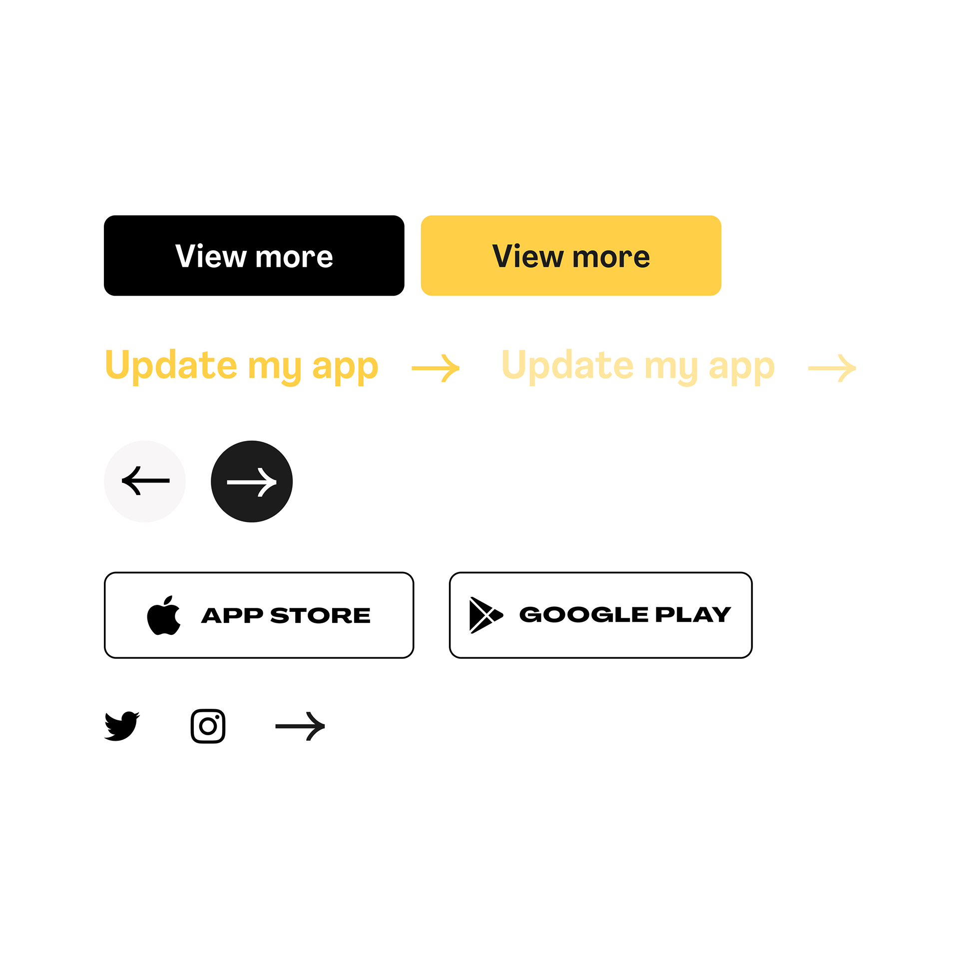
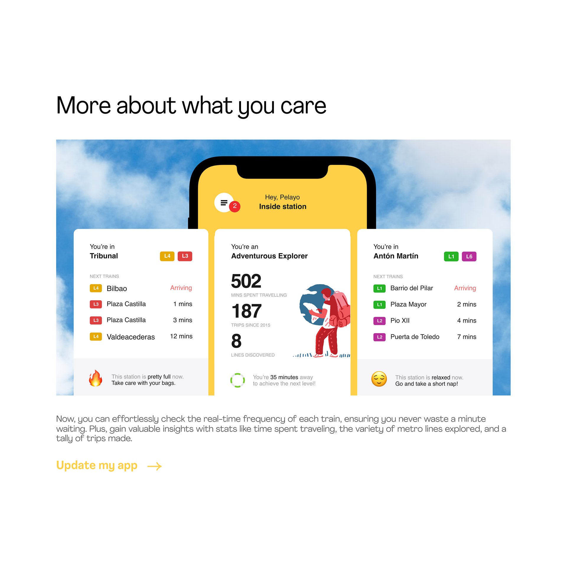
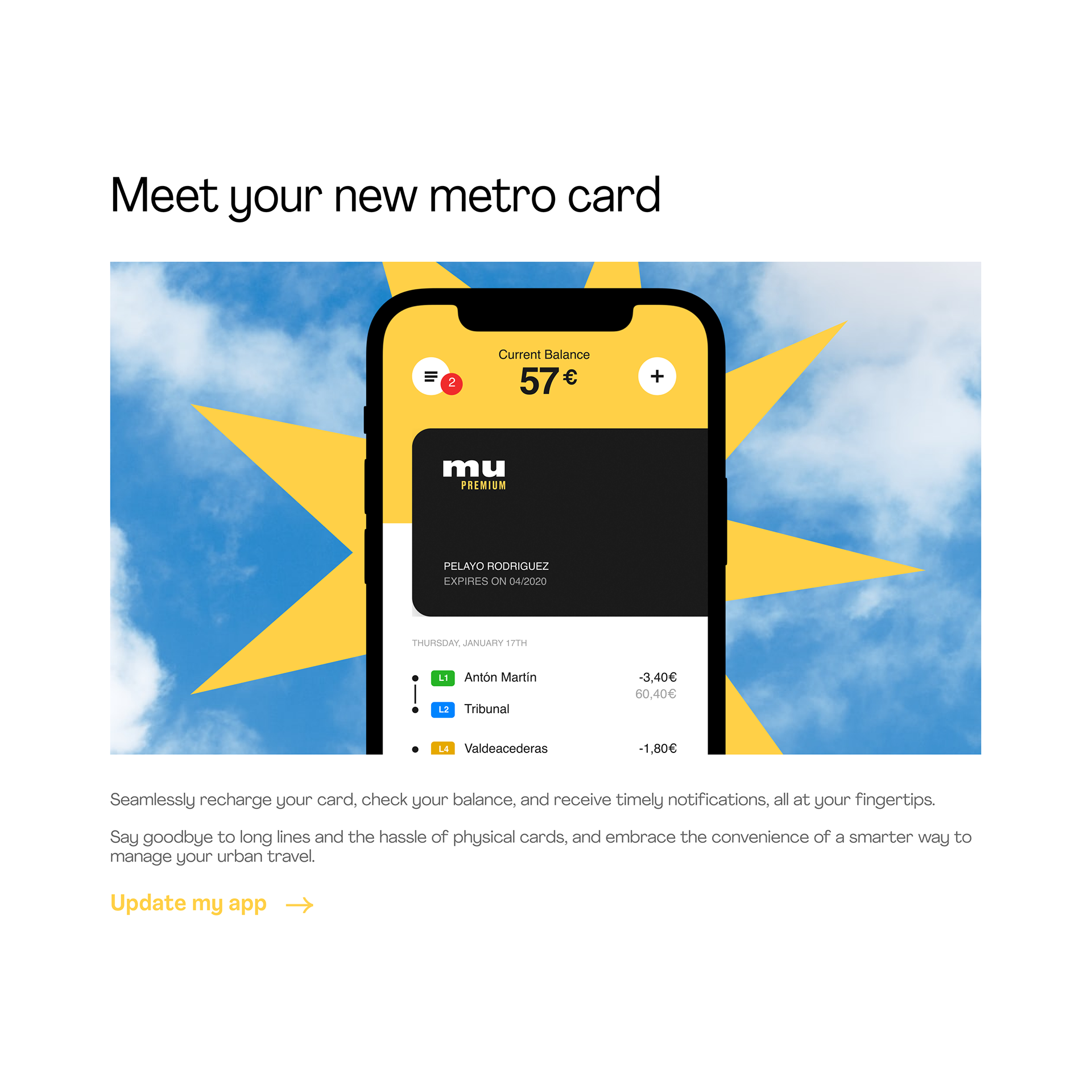
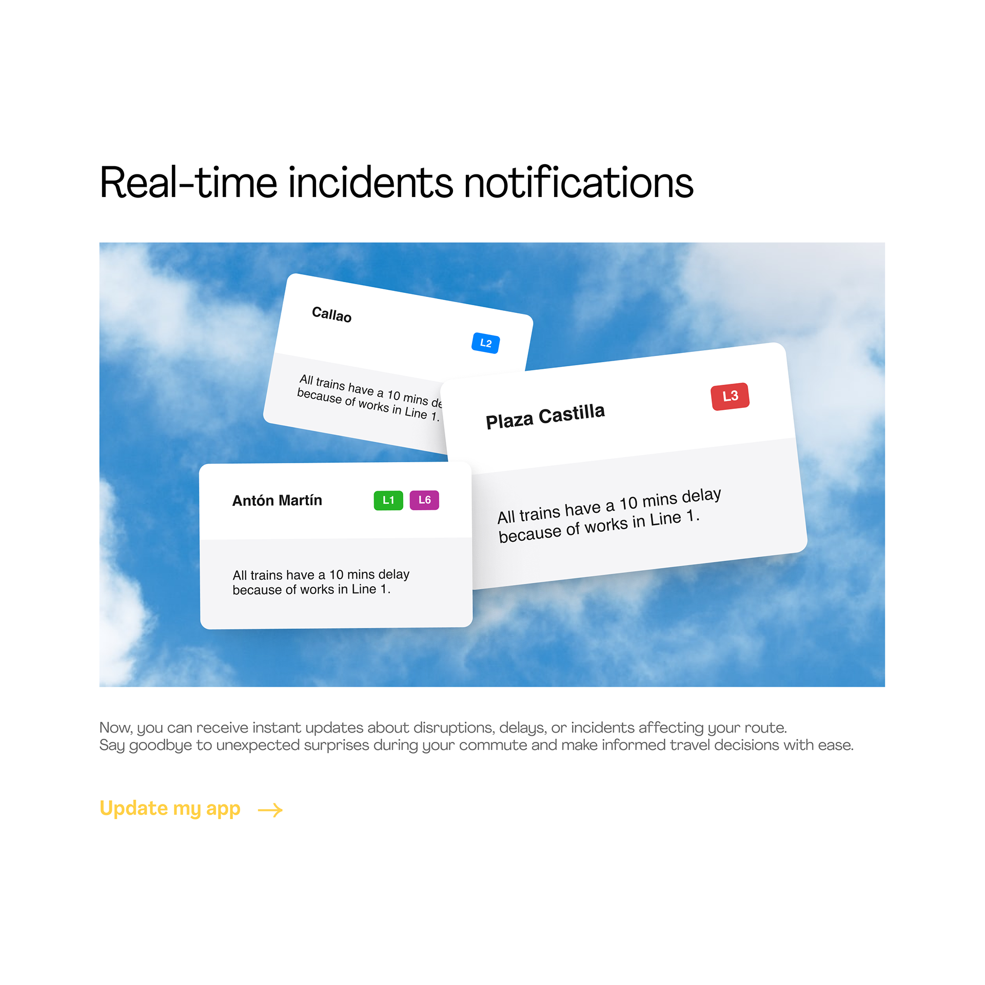
Bold graphics to draw attention. The visual impact is key to draw the attention of the public, that's why I have opted for eye-catching and impactful graphics.
A playful design style to match the audience language. The landing design is bold and modern, using emojis and speaking the same language as the target audience.
A sustainability reminder. Images such as the blue sky have been used to keep sustainability and the brand's purpose in mind.
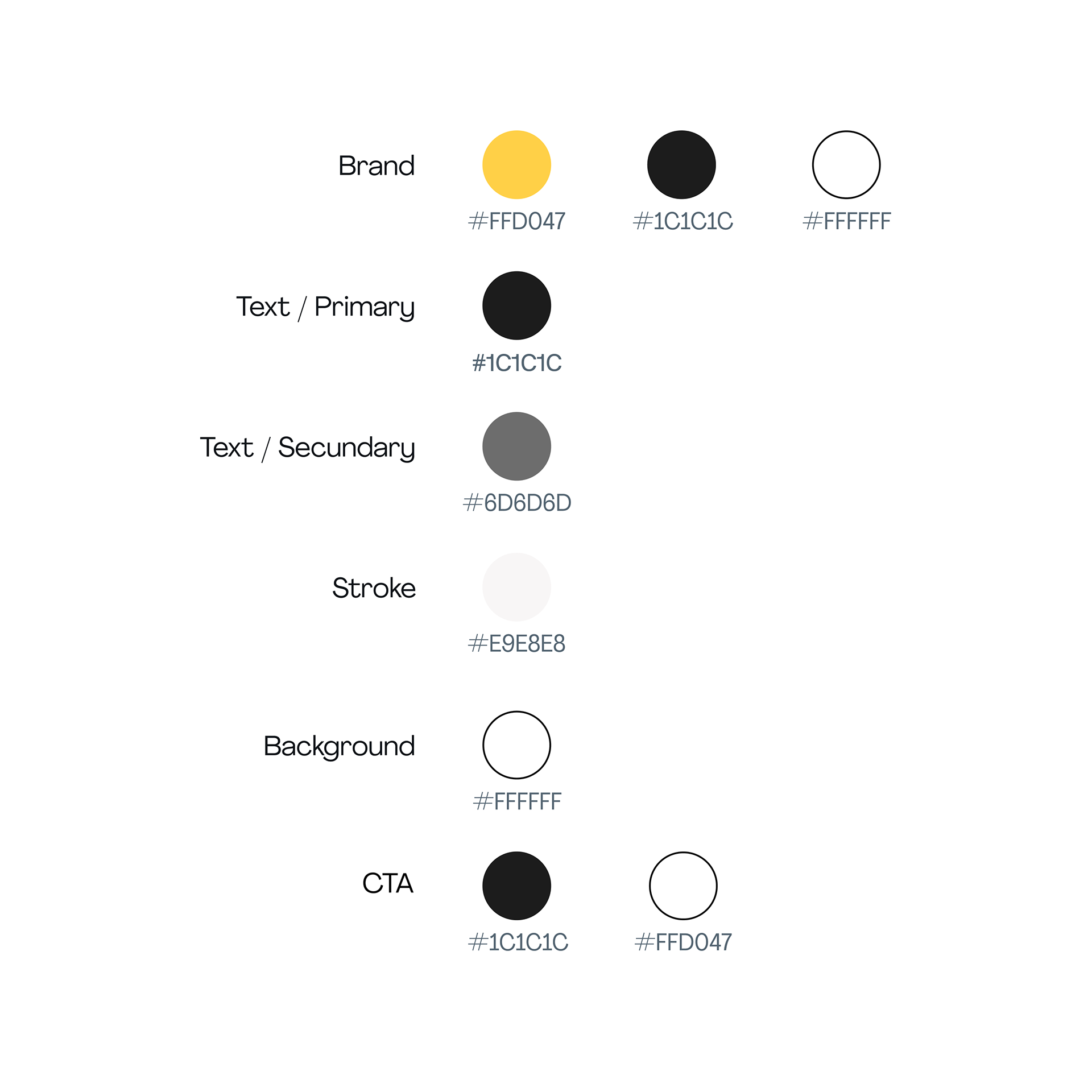
Matching the MU branding. The Metropolis Underground brand identity is always present in the landing page, helping the user to associate the page with the brand and creating a lasting brand image.
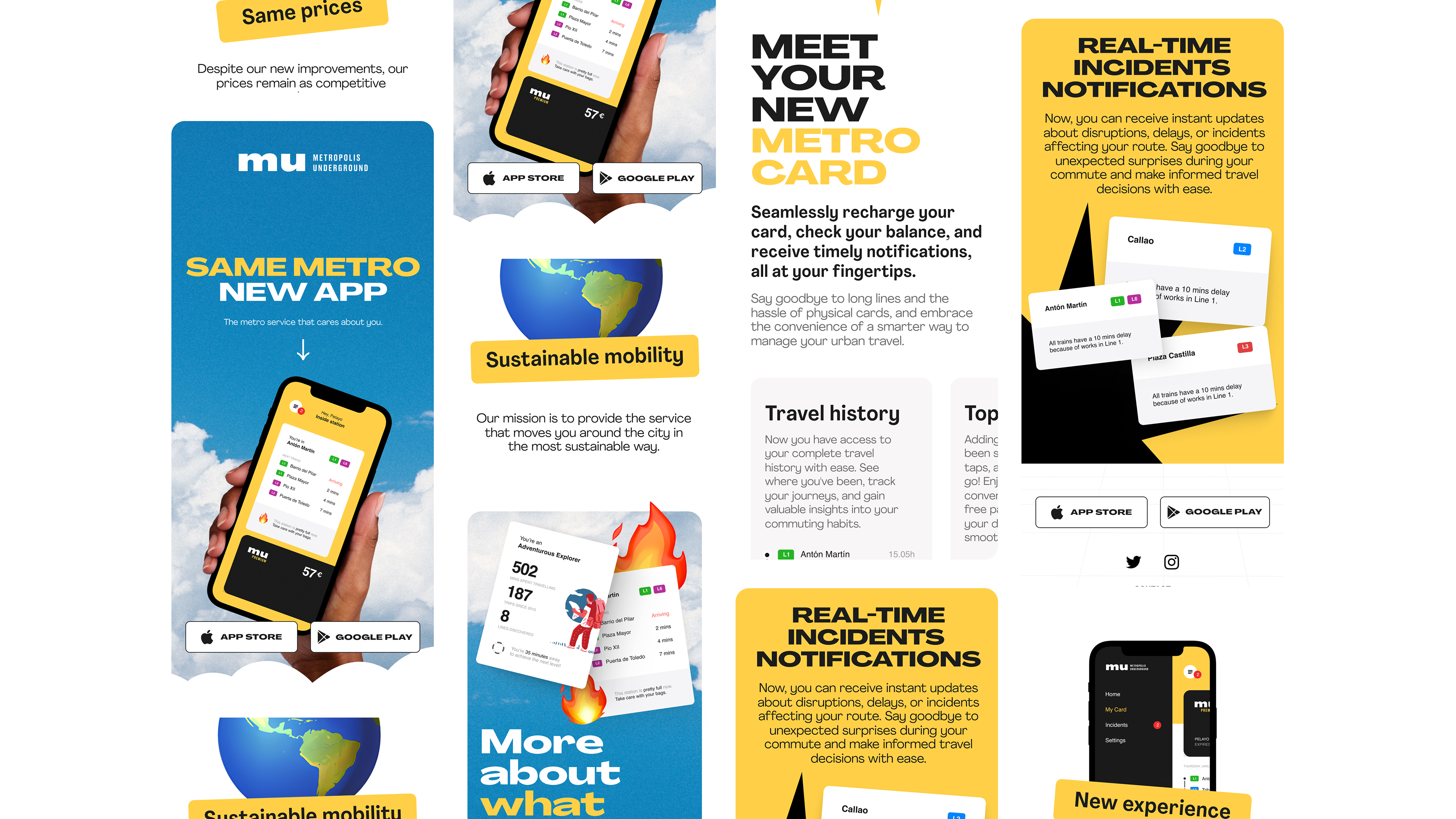
Mobile Version
I've taken the bold and captivating elements from the desktop version and seamlessly transformed them into a mobile-friendly format. The goal was to prioritize clarity and accessibility, streamlining content and navigation while preserving the essence of MU brand's visual identity.
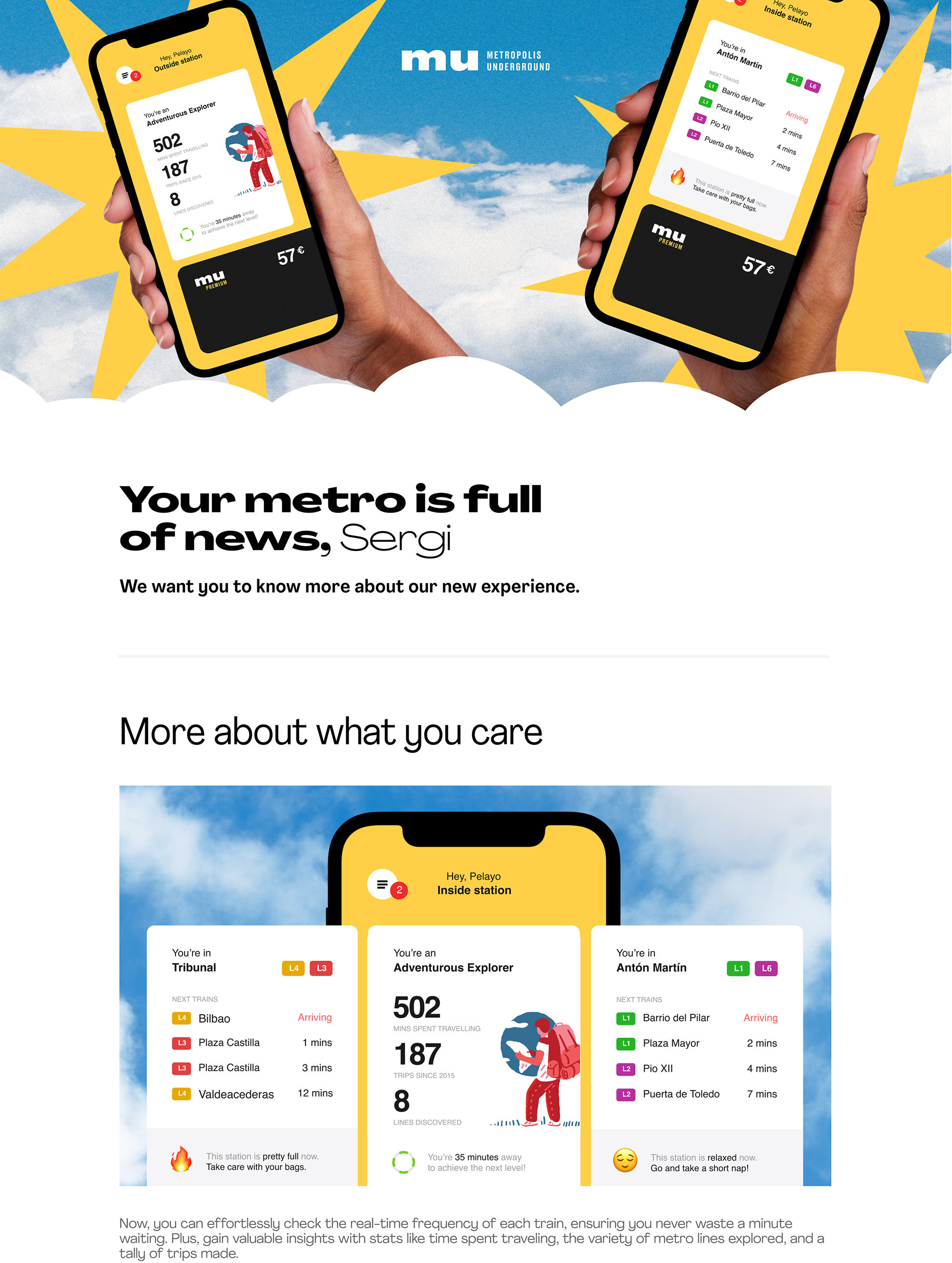
Promotional Mailing - Design Strategy
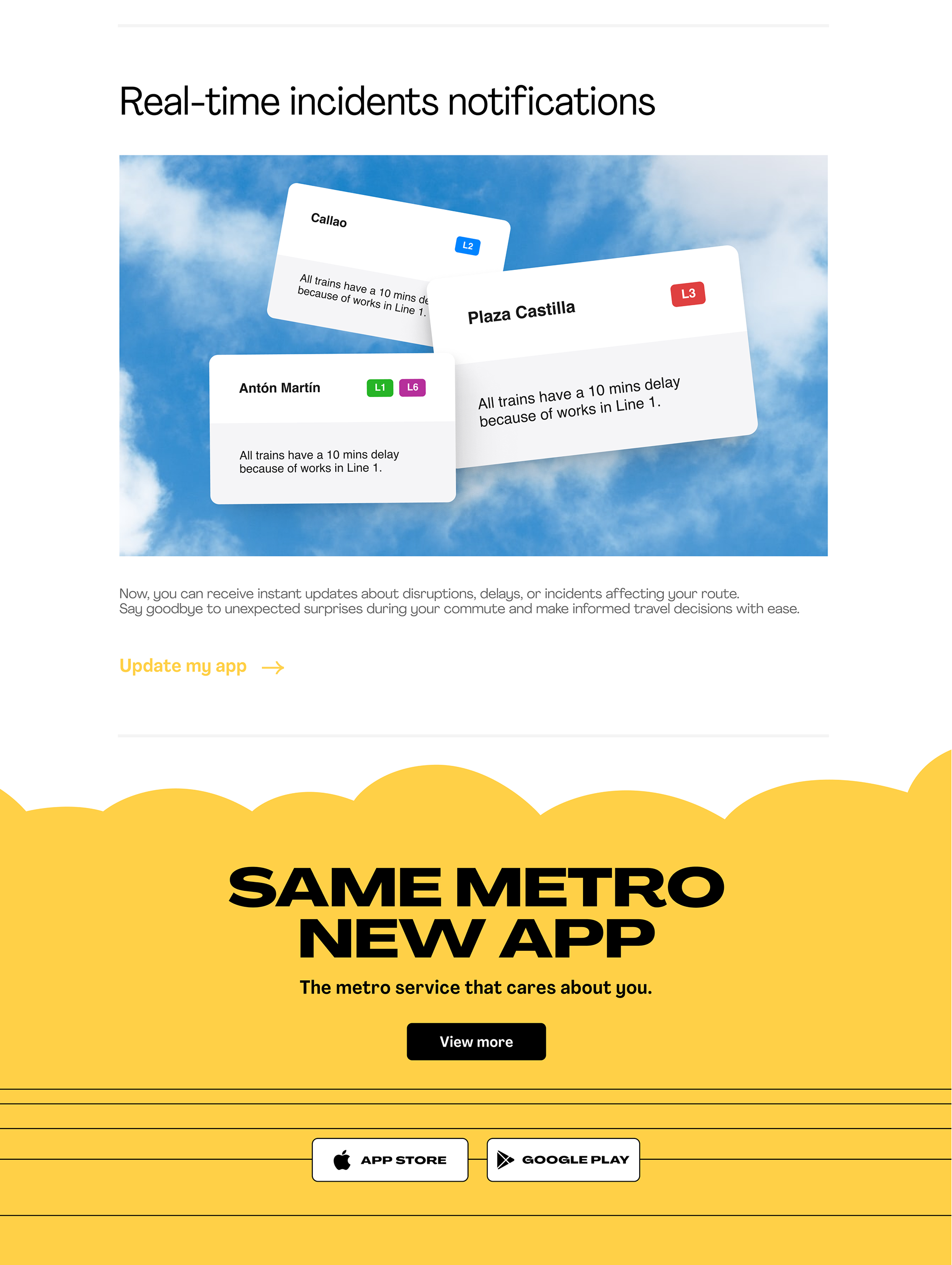
Personalized message. A more personal and direct language helps attract the user's attention and interest in the content.
Relevant information. The information has been synthesized, showing only the most attractive news for the public, leaving the landing page as the informative element.
Visual coherence with the rest of the elements. The same visual style that defines the brand and the landing page has been maintained, ensuring visual continuity between the different elements.
Digital Ads & Social Media
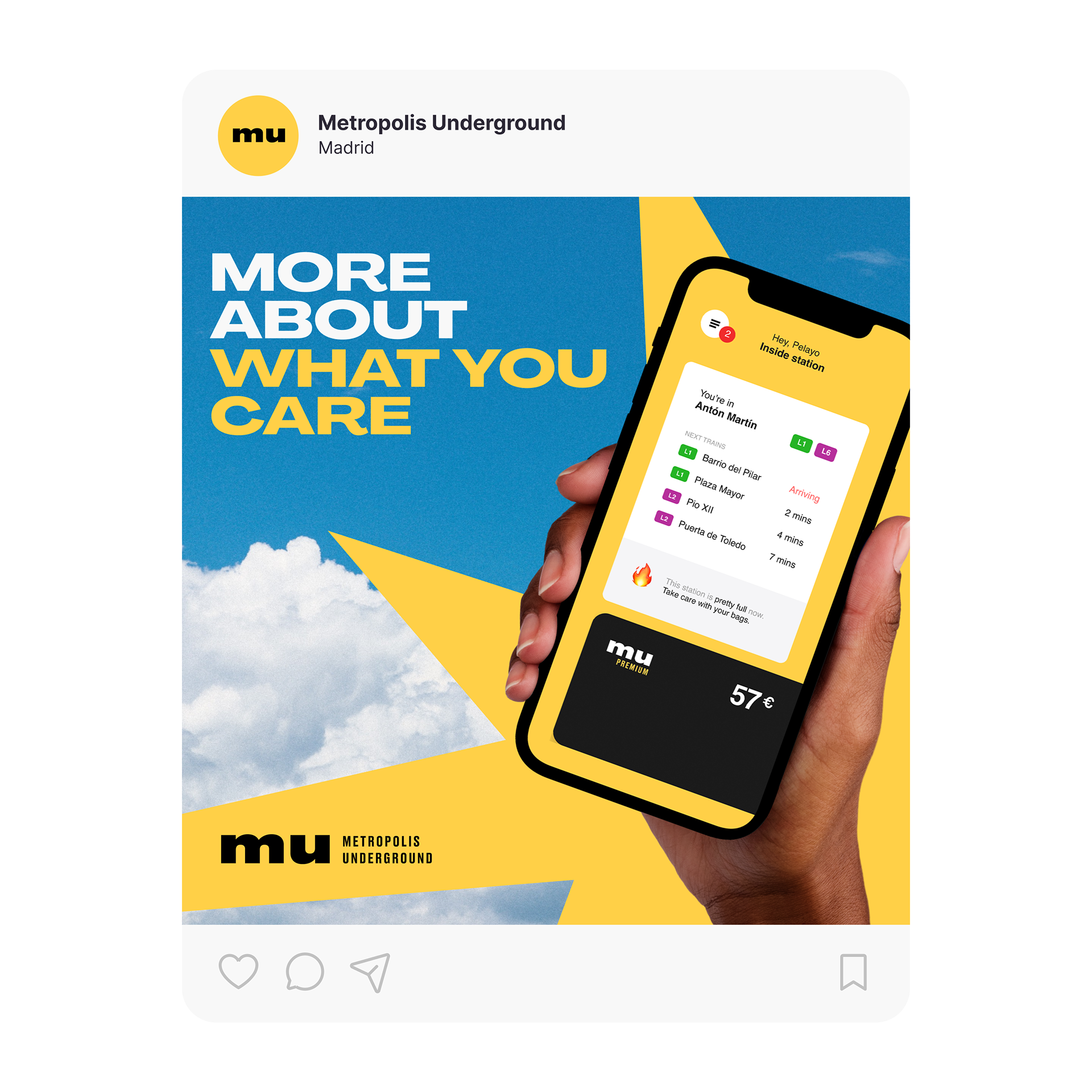
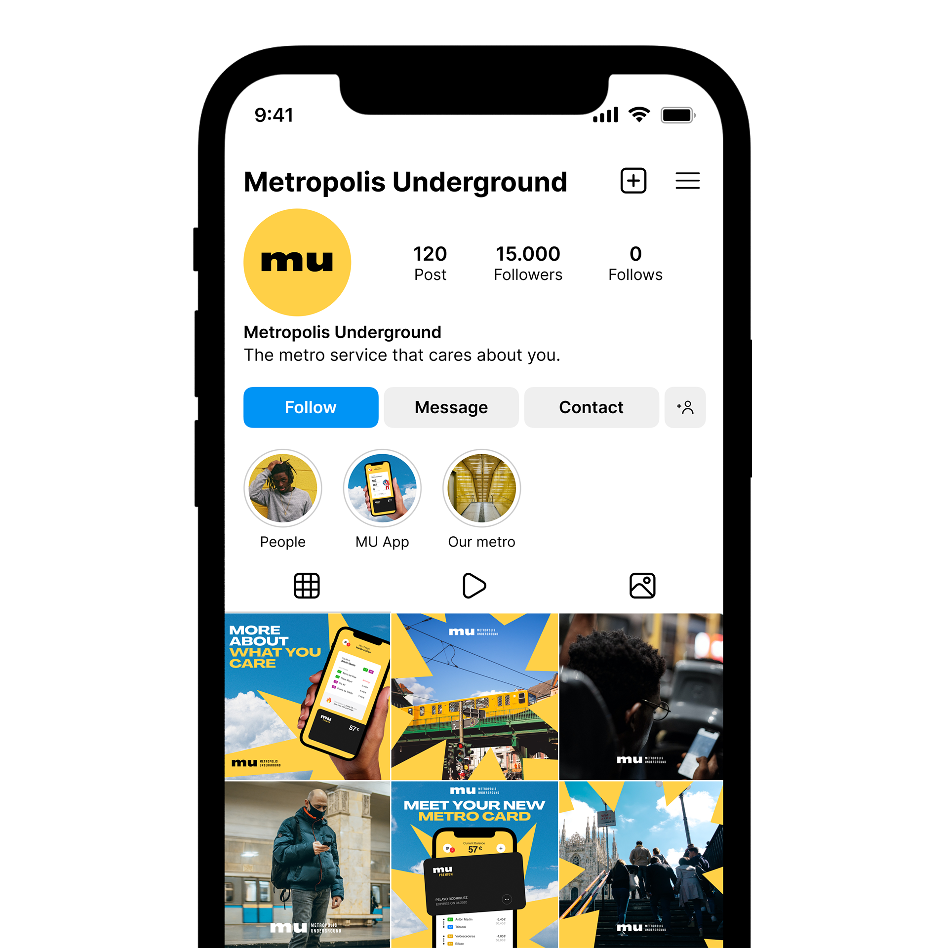
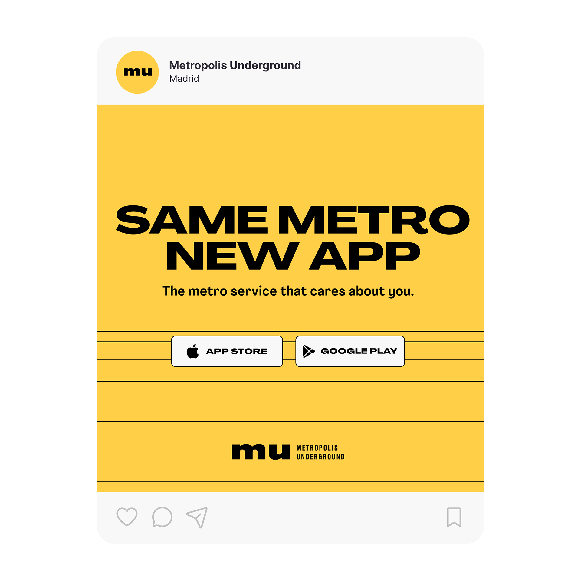
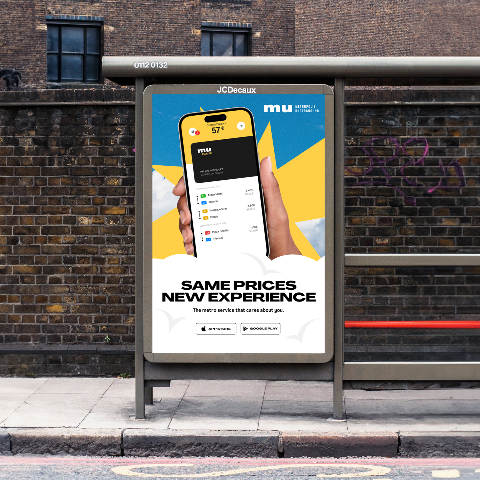
I've carried the brand visual identity to this ads, ensuring every ad exudes consistency and coherence. The messaging is tailored for a young and vibrant audience, speaking their language and addressing their problems.
